![]()
Never expected that math would be one of the things that influence logo graphic design? Well, basic shapes used in math (the circle, the triangle, the square etc.) have been used in art and design for many years, so no wonder that modern logo designers also get some inspiration from the queen of all sciences.
Recently, the fundamental geometric shapes have been very popular in graphic design, so one can confidently claim that they’ve become a trend. The reasons for this are numerous: a math-inspired logo allows for easy readability, quick impact, and branding versatility, which is exactly what designers and brand owners need to make their businesses more memorable.
And by “businesses,” I don’t mean tutors, educational companies, and other brands working with math, but much, much more diverse pool of organizations. So, let’s investigate the most prominent examples of math logos to see how popular brands are using this trend to capture the attention of their target audiences.
The first example on our list comes from a company that has a rather unique product: image and video recognition API designed specifically for digital advertising, fashion merchandising, and affiliate marketing.
This artificial intelligence-powered technology automatically classifies and assigns descriptive tags – bag, red, etc. – to products so business managers can organize and display them on their website or mobile app more efficiently.
A pretty special business that like any other company requires a simple logo to make the brand memorable.
To achieve this goal, the brand decides to go with a basic geometric shape: a triangle. In terms of design, this shape often conveys stability and balance, but can communicate different meanings. In the case of Mirror That Look, two triangles symbolize a reflection in a mirror but also show the innovation behind the brand.
#2. NASA – Circle
NASA’s logo doesn’t get a lot of attention in terms of design but it’s an excellent example of the use of a classic geometric shape, the circle, to convey a complex meaning in a simple way.
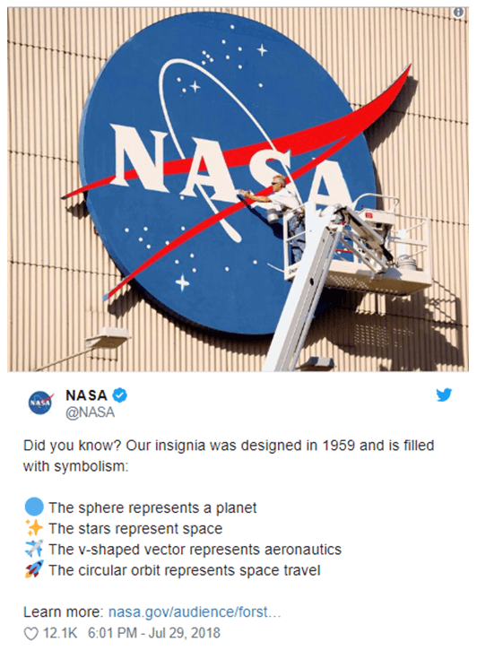
In this logo, the circle represents our planet (the Earn is often called “The Blue Marvel,” which explains the choice of the color). While this shape can be used to convey a plethora of meanings, in this particular case, it also represents a unity of all humans in their desire to explore space and learn new things.
Here’s NASA’s explanation of the symbolism of the logo’s elements using their official Twitter account so you know the whole story.
#3. Microsoft – Square
The use of square is also very popular because this element can convey the following meanings in logo design:
- A high level of professionalism and problem solving ability
- Safety and equality
- Sturdiness and organization
- Smart use of space
- Balance and proportion.
Not only that, but Microsoft is also using different colors in squares to show that the company has a wide range of products. Here’s their explanation, as taken from the official Microsoft’s blog:
“The symbol’s squares of color are intended to express the company’s diverse portfolio of products.”
#4. The Marshmallowist – Cube
The Marshmallowist, a UK-based producer of gourmet marshmallows uses a cube for their logo, which is another popular design technique right now. This shape allows to combine a number of different design elements into one by creating a central hub, which can work especially well for technology companies.

Since mountains are perceived as powerful symbols that communicate confidence, purpose, strength, and adventure, they are often used by graphic designers. Chances are you’ve been a lot of logos featuring mountains in brands selling products such as outdoor equipment, bottled water, camping, and beer.
Mad Giant is a beer company that also uses a solid black triangle mountain symbol to represent the style of the brand and awaken the impulse that all people have to explore.
#6. Toyota – Ellipse
The three overlapping ellipses, the logo of the Japanese carmaker Toyota, have a very unique and symbolic meaning: the unification of the hearts of the company’s customers and the heart of the products (according to the company’s official website). Incredible meaning, right?
And it was made possible by a simple element used in math and geometry.
#7. Wolfram Alpha – Rhombuses
This is one of the most mathematically symbolic logos that comes from an online computational knowledge engine Wolfram Alpha. It allows students and other information seekers to discover information in math, physics, Earth sciences, sociology, and many other sciences using the engine’s incredible ability to generate relevant information powered by AI.
The logo is a range of combined rhombuses that convey depth and complexity of knowledge.
#8. Alison – Triangles
Another way in which a brand can use triangles is to create a complex structure to convey depth, authority, and process, which is pretty good for a company providing online courses like Alison. Their logo uses a chain of triangles representing individual concepts within a subject area that are combined to help to become an expert in the field.
This well-known U.S.-based insurance provider has a plus incorporated directly into the logo in a clever way. It perfectly emphasizes the name of the company as well as makes branding easier.
This is one of the most meaningful and powerful applications of math symbols in logos. The Human Rights Campaign, a non-profit organization supporting equality all over the world, has an iconic logo with a simple yellow equal sign that was developed in 1995.
The logo obviously has a powerful message and successfully made it to the digital era and remains a testament of the strength of a simple mark.
Some of the reasons why the logo remained popular among the organization’s supporters include its versatility and deep meaning; for example, HRC described how 3 million people shared a variation of the logo on social media tailored to support two marriage equality cases in 2013 and even made about 800 more variations.
Use Tools to Help
- Wordmark. A font preview tool that allows choosing fonts by generating quick previews
- Image Color Picker. Find the right color for your logo by choosing from a palette from an image of your choice.
Conclusion
Thanks for checking out our version of the top logos inspired by math. Hopefully you’ve enjoyed the collection and got inspired with some original ideas to represent your own brand (math-related, of course). Remember: math was the strong foundation on which your brand has been built, and the same can easily apply to its logo as well!
BIO:
Donald Fomby is a Digital Marketing Specialist with a Master’s degree in Advertisement. At a relatively young age, Donald has already amassed impressive experience as a freelance writer. Currently, he is an active member of PickWriters translator community. Find him onTwitter @don_fom.