
![]()
Ever wonder why companies choose certain colors to represent their brands? After all, each brand must differentiate themselves within their industry and the colors they use are one way to do this. Some brands have even trademarked their colors, restricting other companies to use them. Think Tiffany blue!
However, when understanding colors it can feel daunting, as colors have almost become second nature to us. If you look around on a commercial street in your town or highly populated areas like Times Square, you’ll notice that there’s an abundance of colors everywhere – all sending a different message, but with the ultimate goal of getting your attention.
Choosing colors for your brand project can be overwhelming and difficult. The best way to approach it? Study other successful company color palettes. Use color palette tools like this one by Bold Web Design, of the Fortune 500, as a resource to understand which colors pair well together and why.
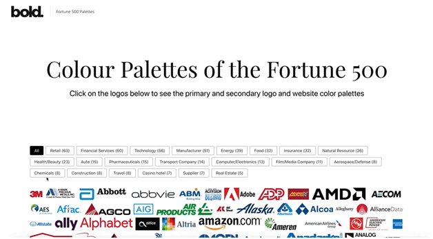
Let’s dive into a few of my favourite examples:
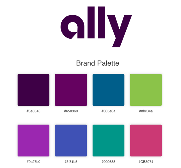
Ally
Having purple as a color in your color palette can be tricky, as it can be associated with royalty and value – characteristics that may make a brand come across as arrogant. However, purple is a nice balanced mix of red’s stimulation and blue’s calmness.
Now how does this relate to a financial services company? With a connection to royalty, purple also translates a message of value. The rest of these colors are on the same side of the color wheel, straying from a high contrast color combination.
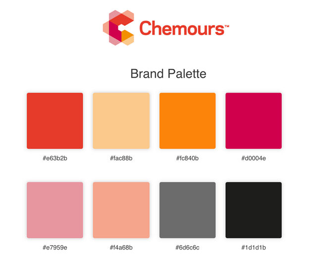
Chemour
Orange is a fun color that brings happiness and energy, making it far from a subtle color. Coupled with other colors like shades of red and pink, this color palette takes a monochromatic color combination.
That means these colors are all closely next to each other on the color wheel, providing a nice cohesion. In an industry primarily focused on facts and safety, esthetic typically takes a back seat and Chemours has changed the game with their bright color scheme.
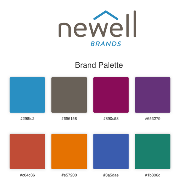
Newell
When you look at this color palette, you may think it represents all. And, you’re right. This palette almost represents all colors on the color wheel. With its main color consisting of blue, you may associate that color with calming and relaxing qualities, but it also represents trust.
As a maker, marketer, and distributor of many different brands Newell must cater to an array of customers. With blue as an anchor, the many complementing colors show the different brands they cater to.
Mastercard
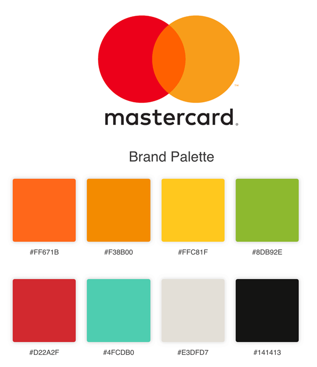
Dealing with finances is no walk in the park and Mastercard knows that. Why use orange and red for a financial services company? Red is a warm and positive color that draws attention to itself and stimulates an action, such as a swipe of your credit card. Orange, takes the energy of red while also the happiness of yellow bringing enthusiasm and stimulation – qualities you want your customers to have when you using their credit card. This brand also uses a monochromatic color combination with green as complementary colors.
Edison International
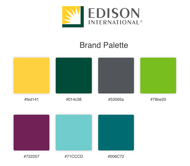
As one of the largest electric utilities and energy providers, their colors are representative of the services they provide. When you think of energy, you most likely think of nature as it comes from nature. Green directly represents energy and evokes a feeling of safety – a common interest of all energy consumers. Edison has replicated that with variations of green, a bright yellow spotlight color, and a creative purple. The greens and yellow are a monochromatic color combination with purple acting as a complementary color directly across from them on the color wheel.
Conclusion
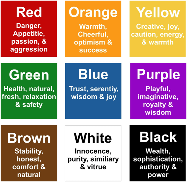
When it comes to colors, there’s much more than just which tone or shade looks better in the color palette. Colors have meanings that instill the brand messaging and marketing that’s related to the brand’s services and products.
Whether you’re preparing for your next design project or delving into the realm of colors out of pure interest, research the top 500 companies that have successfully utilized colors to propel them forward.
Author Bio
Debbie Morgan from Bold Web Design, is a writer that loves adding a witty analogy to any concept. With experience in the design and marketing industry, she’s seen her fair share of designing do’s and don’ts but loves to bring color to her explanations of these helpful concepts.