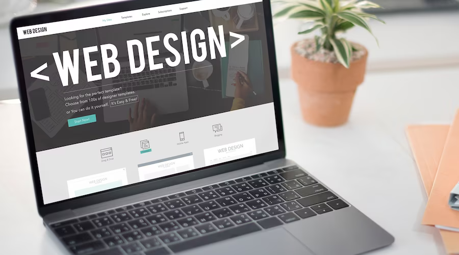
Let's see how website design can be a trendsetter Click To Tweet
1. Particle backgrounds
Particle backgrounds are a great solution to performance issues websites designs run into with a video background. These animations are lightweight javascript that allows movement to be created as a natural part of the background, all without taking too long to load.
They say that an image says more than a thousand words, and a moving one certainly does. Similarly, particle backgrounds immediately attract the user’s attention, so brands can create a memorable impression of themselves in only a few seconds. Additionally, motion graphics like these are becoming more and more popular on social media, providing eye-popping leads back to landing pages. know the anatomy of a landing page.
2. Better visuals through typography for website design
In the battle for eyeballs, typography is a powerful weapon, and its use on the web has broadened out this year. Typography is powerful and the bigger the better. So while neo-grotesque sans-serif styles like Helvetica remain in vogue, designers are branching out, turning to the huge variety of typefaces available. The fact that device resolutions are getting sharper, ramping up the legibility factor, is also opening the door for a rise in custom fonts. “Designers are opting for typography with tons of personality not only for emphasis but also for aesthetic effect.
3. Web animation an effective tool
In a world where everyone is in a hurry and time is short, animation can convey complex ideas in a short amount of time whilst at the same time engaging and informing. Storytelling and personality is something that new and old brands, are working on in order to capture users’ attention, and animations are starting to play a bigger role in this. Animations have shown and will continue to show the brand’s strength in our digital world, giving a strong personality to the brand, making it less static and more dynamic. So what specifically in animation are we going to see more of in 2018? Animated logos are an obvious trend and one that gives a company a big opportunity to enhance their brand further.
4. Colour schemes should be Vibrant & saturated
For website design 2018 is definitely the year for super excess colours online. While in the past many brands and designers were stuck with web-safe colours, more designers are becoming courageous in their approach to color—including supersaturation and vibrant shades combined with headers that are no longer just horizontal but reimagined with slashes and hard angles.
This is partly helped by technological advances in monitors and devices with screens that are more suitable for reproducing richer colours. Vibrant and even clashing colours can be useful for newer brands hoping to instantly attract their visitors’ attention, but it is also perfect for brands who want to set themselves apart from the ‘web-safe’ and the traditional.
5. Don’t use shadows and depth
The use of shadows is not new, so why mention it? Although shadows have been a staple of web design for quite a while, thanks to the progress of web browsers, we now see some exciting variations. With grids and parallax layouts, web designers are playing with shadows more than ever to create depth and the illusion of a world beyond the screen. This is a direct reaction to the flat website design trend that was popular in years past.
6. Storytelling website Design
There is now a huge emphasis on effective storytelling through design, conveying often complex information as simply and as engagingly as possible to a variety of audiences. Designers are thinking outside the box with new, bespoke creations – the muted palettes of old ditched in favour of vibrant colour transitions paired with minimalist yet bold typography. So what does 2018 hold for information design? “Greater accessibility to new technology will undoubtedly see an increase in the number of designers using animation as a means of storytelling.
Shadowplay creates a surprisingly versatile effect that increases not only the aesthetics of a web page but also helps User Experience (UX) by providing emphasis. For example, using soft, subtle shadows as hover states to designate a link is not a new idea, but combining them with vibrant colour gradients (more on that later) like the examples above enhances the three-dimensional effect of the old shadows.
7. Custom illustrations
The Illustrations are great, versatile media for creating images that are playful, friendly and add an element of fun to a site. Experienced artists can make illustrations that are full of personality and tailored to a brand’s tone—what all brands strive for in markets that get more crowded each year.
While this trend is perfect for businesses that are fun and energetic, it can help make brands that are typically perceived as serious and right-brained more approachable to their customers. Whatever your brand identity is, there’s likely an illustration style to match it.
8. Asymmetry and broken grid layouts
One big change in 2017 was the introduction of asymmetrical and unconventional ‘broken’ layouts, and this web trend will still be going strong in 2018. The appeal of the asymmetrical layout is that it is unique, distinctive and sometimes experimental.
Although large-scale brands with a lot of content still use traditional grid-based structures, I expect an increase in the use of unconventional layouts across the web, as brands create unique experiences to set themselves apart. Traditional companies generally might not be interested in this aesthetic, but bigger brands that can afford to be a little risky will expect out-of-the-box ideas from their web designer.

Post Comment